Color is a powerful tool that can be used to evoke emotions, influence behaviors, and create memorable experiences. In the realm of user experience (UX) design, color psychology plays a pivotal role in shaping user perceptions and guiding their interactions with digital products. By understanding the principles of color theory and the emotional resonance of different hues, designers can craft immersive and impactful experiences that resonate with users on a deeper level.
The Science Behind Color Psychology
Research has shown that light and color can have a profound impact on our physiological and psychological states, affecting our mood, sleep, heart rate, and even our well-being. Within 90 seconds, customers form an opinion about a product, with color influencing that opinion 90% of the time. Color is also the easiest element to remember when encountering new things, making it a crucial element in UX design and marketing.
Understanding Color Theory
Color theory is a set of guidelines and principles explaining how colors interact and how they can be combined to create visually appealing compositions. Key concepts in color theory include:
Hue:
The pure form of a color, such as red, blue, or green.
Saturation:
The intensity or purity of a color.
Brightness:
The lightness or darkness of a color.
The Color Wheel:
A visual representation of color relationships, often used to illustrate concepts like complementary colours, analogous colours, and triadic colours.
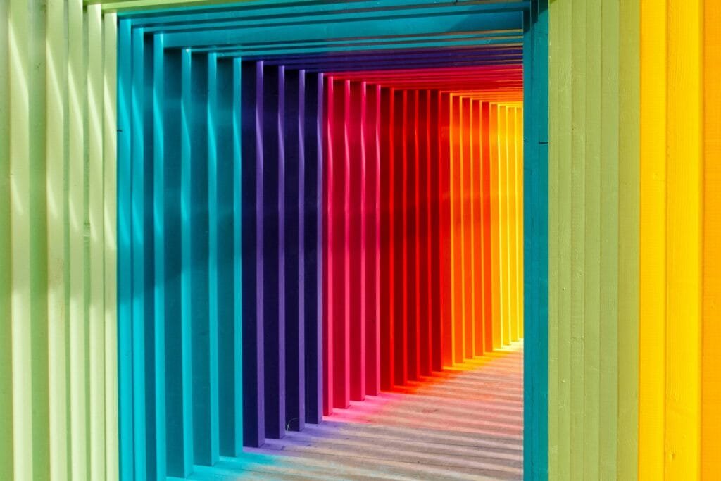
The Emotional Language of Color
Each color carries its own unique emotional baggage and cultural associations. Some common colour associations include:
- Red: Passion, excitement, urgency, danger.
- Blue: Trust, calmness, stability, security.
- Yellow: Happiness, optimism, warmth, energy.
- Green: Growth, harmony, freshness, nature.
- Purple: Luxury, spirituality, creativity, mystery.
- Orange: Youthfulness, energy, creativity, enthusiasm.
- Black: Power, elegance, sophistication, mystery.
- White: Purity, innocence, cleanliness, simplicity.
The Impact of Color on User Experience
By understanding the psychological effects of color, UX designers can leverage this knowledge to create more engaging and user-friendly experiences:
Evoke Desired Emotions: Color can be used to create specific moods and atmospheres within a digital product. For example, a meditation app might use calming shades of blue and green to promote relaxation, while a fitness app might use energetic reds and oranges to inspire action.
Enhance Visual Hierarchy: Color can be used to highlight important elements and guide users’ attention to key areas of the interface. For example, a call-to-action button might be designed in a contrasting color to make it stand out from the surrounding content.
Improve Brand Recognition: Consistent use of color can help to strengthen brand identity and make a product more memorable.
Boost Conversion Rates: Studies have shown that color can have a significant impact on conversion rates. For example, HubSpot found that red call-to-action buttons outperformed green ones by 21%.
Best Practices for Using Color in UX Design
Follow Brand Guidelines: Adhering to brand guidelines ensures consistency in color usage and helps to reinforce brand identity.
Consider Target Audience: Furthermore, color preferences can vary depending on factors such as age, gender, and cultural background. Designers should research their target audience and choose colors that resonate with them.
Use the 60-30-10 Rule: In addition, this rule suggests using a dominant color for 60% of the design, a secondary color for 30%, and an accent color for 10%, creating a balanced and harmonious color scheme.
Ensure Accessibility: Moreover, designers should choose colors with sufficient contrast to ensure readability for users with visual impairments.
Test Color Choices: Lastly, A/B testing can be used to evaluate the effectiveness of different color choices and identify the colors that perform best for a particular audience.
Real-World Examples of Color Psychology in UX
Many successful brands have effectively used color psychology in their UX design:
- Netflix: The use of red in Netflix’s logo and interface evokes excitement and entertainment.
- Headspace: The calming blue hues used in the Headspace meditation app create a serene atmosphere.
- McDonald’s: The vibrant red and yellow colors used in McDonald’s branding stimulate appetite and create a sense of excitement.
- Facebook: Finally, the consistent use of blue in Facebook’s interface fosters a sense of trust and security.
Conclusion
Color psychology is a powerful tool that can be used to create engaging, user-friendly, and memorable UX designs. By understanding the emotional language of color and following best practices, designers can harness the power of color to create digital products that resonate with users and achieve business goals.